Building a complex commercial photograph in the studio. Part 1
Case Study
As I have mentioned in previous blogs, an impactful commercial or advertising photograph works on a few distinct levels. Some of the considerations are; can the photo pull the attention of the desired audience? Does the image aid in the visibility, individuality and recognition of the brand? Can people easily digest the intended message of the image? Is the photograph generating a sense of aspiration? And importantly, is the technical execution of the photograph equal to the market leaders?
Obviously, some photographs are more important than others. The expectations from a hero photo for a renowned brand in a luxury market rates pretty highly. I have been photographing food, drinks and bottle photography for Angove Family Wines for over ten years. It’s a pleasure to work with folk who truly understand the long-term value of a refined, well-crafted advertising photograph to their brand.
There is a lot of planning required to fully realise a strong advertising photograph, and this particular image was full of complexity. The brief was; to provide a hero group photograph of the complete range of distilled Angove products, placing the most expensive products as the centrepiece of the composition. The bottles need to be photographed together to look plausible as a group in situ, and the feel of the image needs to exude richness. In this type of studio situation, I have complete control over every element but this also means every choice has to be deliberate, cohesive, and in service of the storytelling.
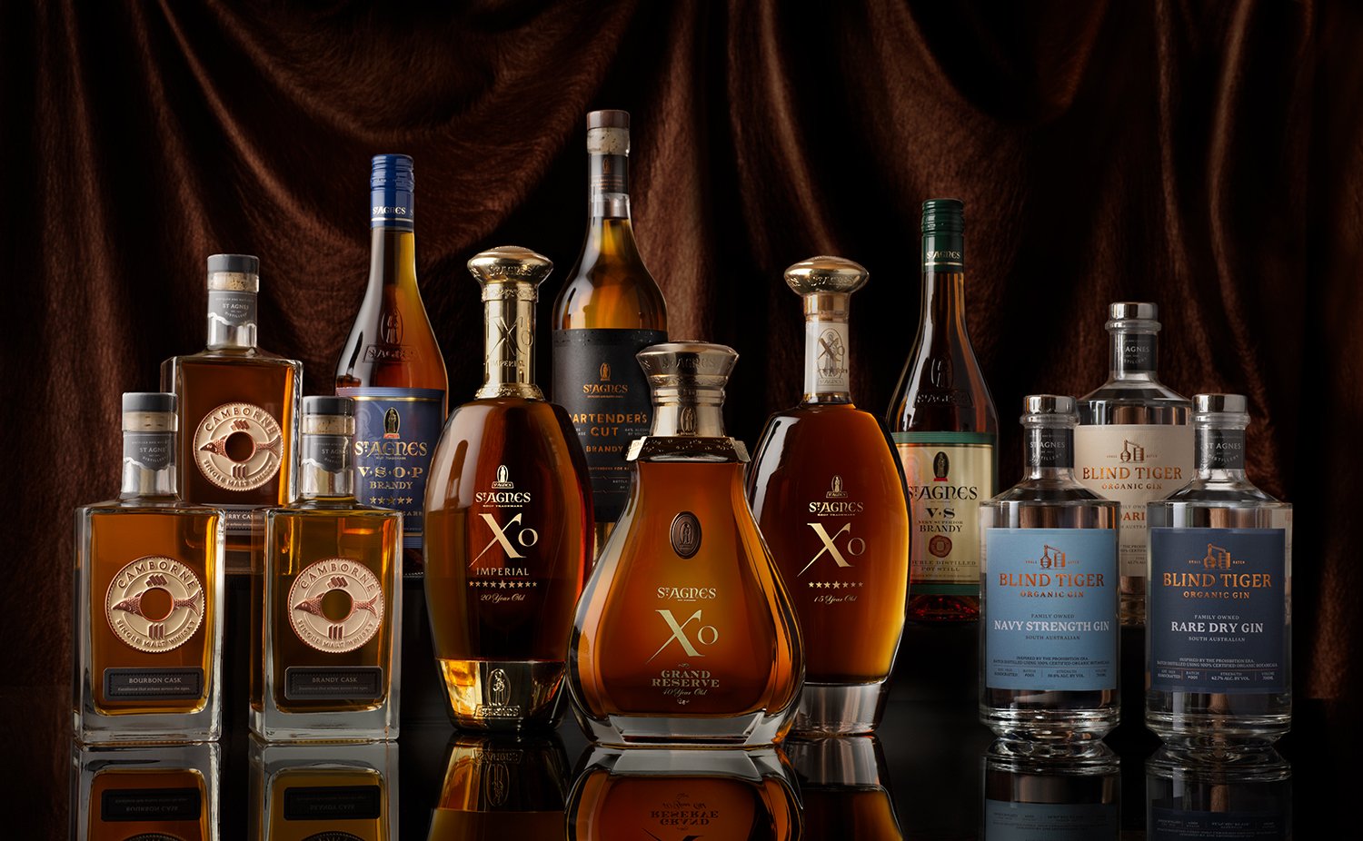
The primary objective is clear communication, which makes legibility a priority in any commercial photography. It needs to be obvious what each product is, so within reason, I tried to make the labels and names of each product as legible as possible.
The secondary objective is to build a cohesive photograph that stirs a strong feeling through the combination of all of the elements whilst clearly communicating the nature of the product. The tone of the lighting, the refinement of the setting and the ornate nature of the bottle design are all aimed at telling a specific story. If the background was bright neon lights in pink and green or if this photo was over-lit, it would cheapen the feel. If it were shot on white, most of the charm would disappear. There is a feeling generated through the set of choices of how this was shot that speaks of a premium quality product for special occasions. Every choice within the production of these photographs preservesCheck out part 2… how the products are perceived in the marketplace.
Trying to shoot this photo using a single lighting state, in a single shot would have been extremely limiting. It would have dulled the image immeasurably, as options of backlighting and targeted highlighting just wouldn’t have been possible. By building a composite image I was able to shoot as a group but also isolate and specifically light each bottle. The final image is a composite of about 40 separate images shot in a very specific sequence. Some are tiny highlights and others are most of a bottle with its relevant reflection but each photo brings more lustre and detail to the final photo. Once a bottle is moved it's almost impossible to place it back exactly where it was.