Building a complex commercial photograph in the studio. Part 2
Case Study
Most commercial photographs are obviously overly refined subjects in heavily manipulated situations. Perfection of this sort rarely occurs in real life but like when going to see a film, we accept the premise that it's entertainment and buy into the storytelling. There is a lot to consider to make an image that doesn’t look too stiff, is easy to understand, and has impact.
There are four key components when compiling an image of this nature, the composition, the subject, the setting and the lighting.
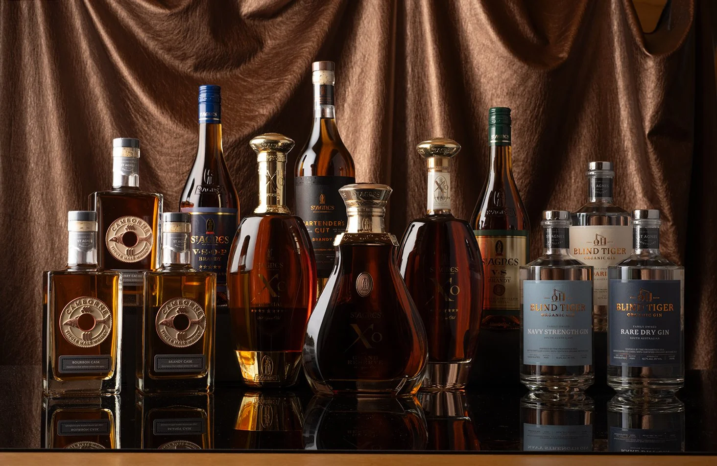
The placement of the bottles in an advertising photograph like this speaks volumes about the hierarchy within the product range. The brandy bottles are the intended stars and also happen to be the most elegant bottles. I see the composition as the foundation point and most of the subsequent decisions hinge around where things are within the frame. It's about deciding which configuration of shapes best serves the flow of the image whilst telling the story. I cut squares of wood into small plinths to vary the heights and wrapped them in black paper. Then it comes down to final decisions on the camera height, lens choice, focal point and aperture as these are constants once I make a start.
At this point, I have a clear but unrefined plan for the way this image will read. Long before any finessing of the bottles most of the working out has been done. I need to know the angles and visibility of each bottle in relation to the boundaries of the frame and in relation to all of the components. I need to make sure each bottle is well placed within a strong composition. I do all of the broad planning without the black acrylic sheet for the table as there is less risk of scratching the surface. I can make big changes and not be precious if a better idea presents itself. I take a reference shot then tear it all down and meticulously clean everything. Then it’s on to the final placement.
Ideally, once the subject, background and foreground are all in their final positions the camera and the subject must not move at all from the first photo to the last. If every part is shot with the camera in a constant placement and setting, the end image will have the greatest potential to look believable.
Positioning the bottles on a flawless reflective surface alludes to a special location that is refined, highly maintained and intended to create an impression. It’s also a stunning look from the reflected ambers and glass.
The background material was chosen for its colour and texture. Even though it was darkened down in the final image, its warm tone, the deliberateness of its folds and the look of fine leather make it feel intimate and refined. I was able to place the background about a metre behind the setup, which alludes to depth and reduces its sharpness and the risk of it fighting for attention with the bottles. This also allowed me plenty of space to get in and work from behind the bottles.
Light is the real star in this image as it sets the mood. Though this lighting state isn’t possible in reality, if the hardness/softness of the light, its colour temperature, height and direction overall, sit cohesively together, then the lighting will feel plausible. Lighting bottles can be a challenging prospect. They vary in translucency, are highly reflective a have complex curves. Then they have labels made from entirely different materials. In this case, some of the bottles have metallic printing and ornate metal ingots. I needed to use several light modifiers to expand and soften the light as well as various reflectors.
Early on in the shooting, I started assembling the final image as I had to make sure that I had all of the necessary segments for every bottle, background and foreground. To achieve my vision I was constantly referencing the working version of the photograph and specifically tailoring exposures. I gathered a complete lighting state for the bottles in the back row, then I removed them to be able to backlight the front row. I kept adding detail until I had built a group of beautifully lit individual bottles.
“Once again another stunning piece of photography from Andy with our full St Agnes Distillery product range in one amazing shot. Simply phenomenal and Andy is one of the greatest people we have had the pleasure to work with.”
Matt Redin, Marketing Manager


